
V6N2: Research Informed Design: Process, Experience & Results from Students & Their Audiences: A Case Study
By Michael Hanley, Vinayak Tanksale, Jennifer George-Palilonis | March 4, 2013
Introduction
Both print and broadcast news outlets have begun to view “interactivity” as both a technological concept and a news philosophy through increased development of online-only content, such as interactive graphics driven by animation, videos, blogs, reader-generated content, and games. Likewise, interactive advertising, and most emerging digital media, provides one of the few bright spots for advertising media companies. Digital media channels grew during the past year, while nearly all traditional media recorded declining or flat revenue growth. PQ Media’s Alternative Media Matrix tracks spending for 18 alternative and digital media, including interactive TV. In 2007, all 18 segments posted double-digit growth; 12 grew faster than 20 percent. According to TNS Media Intelligence, only eight of the 19 mostly traditional media categories it measures grew during 2007. (1)
The digital age has also paved the way for intense collaboration among new sets of partners. For example, traditionally, computer science students pursue careers in software development, web programming, scientific computing, and information technology development. However, there is a plethora of emerging media domains where computer science expertise is absolutely necessary. Computer Science students are increasingly collaborating with interface designers and content creators. Rather than just implementing a given design, computer science students are an active part of the interface design process.
This paper reports a number of related outcomes of a project that involved design, development, and usability tests of new applications for two emerging types of interactive media: 1) an interactive television platform, and 2) a local news application or Apple’s iPhone and iTouch. In the spring of 2008, an interdisciplinary group of three professors and 31 undergraduates at Ball State University focused on advertising, computer science, journalism graphics, and broadcast multimedia, collected feedback about interactive television and iPhone interfaces designed for the presentation of multimedia news and advertising content. They employed a research-informed design process and basic usability tests to develop and assess their work, and this paper will report their findings by highlighting trends in user feedback, as well as provide some tips for effective interface design.
Review of Literature
Digital media provides content developers with increasing levels of interactivity, offering opportunities to get closer to audiences than ever before. Interactive advertising, for example, has increased audience participation for several high-profile companies, such as Nokia, Virgin Records, and Jack Daniels. And news outlets from both print and broadcast have jumped headfirst into multimedia storytelling as media convergence and online editions have gained popularity and import among traditional audiences. (2) Likewise, content providers are taking advantage of the rapid growth in platform and device technologies by broadening the number of outlets they target for their products. For example, since the release of Apple’s iPhone in 2007, several newspapers have designed Web sites that are optimized for iPhone viewing. In March 2008, the Chicago Tribune launched a beta version of its iPhone site. And an iPhone interface and portal by Texterity (www.texterity.com) allows users to view thumbnails that have been optimized for iPhone viewing of more than 50 magazines.
While interactive platforms for television have gained popularity and use in the United Kingdom and New Zealand, (3) platforms in the U.S. have been slow to go beyond what’s offered through standard digital video recorders (DVRs), such as Tivo, and satellite and digital cable boxes. Furthermore, although more people than ever are watching more television than ever, they aren’t doing so in traditional ways. (4) Rather, they are using video on demand, DVRs, streaming video online, or watching video on other devices, such as iPods or cell phones. Thus, a number of providers are racing to develop the next big interactive content and technologies for TV. For example, Tru2way, developed by Comcast, Siegal+Gale, and CableLabs, is the latest interactive digital cable service delivered over the cable video network. The service includes interactive program guides, interactive ads, games, chat, web browsing, and t-commerce, to name a few, and major cable operators plan to provide support for the platform in more than 90 million U.S. homes by the end of 2008. (5)
Similar transformations are occurring in newsrooms across the country as journalists scramble to adapt traditional storytelling methods and news coverage routines to address the perceived demand for interactivity. Burger found that younger audiences perceive online sources of news and information to be as credible as their print counterparts, while older audiences are more apprehensive about online sources. (6) This trend may suggest that as younger audiences get older, online sources will become more and more prominent as primary sources for mass audiences. Likewise, Schaffer explored a number of ways news media are using interactive features and multimedia strategies to engage audiences with the news. In addition to online methods, Schaffer pointed to portable kiosks for surveying public opinions and web cam interaction between audiences and the media outlets that serve them. (7)
The rush to develop and explore leading edge content delivery methods that include a significant amount of interactivity and user choice won’t subside soon. And as much attention is being paid to exploring best practices in design and development as there is to the gadgets we use to obtain content. According to Furht et. al., fundamental concepts in the areas of interactive media design, both for content and devices, “include video and audio compression, multimedia data storage and retrieval, networking and synchronization.” (8) And, most designers and developers recognize the importance of understanding the differences among platform types, from functionality to design, and technical considerations to user experiences.
By the end of 2008, there will be four billion mobile phone subscribers around the world; that is one-half of the global population. A number of factors drive the adoption of touch screen mobile devices. Consumers are demanding more intuitive user interfaces and personalization options, which are often unavailable on traditional mobile devices. A larger screen size also provides a higher level of consumer experience.
The number and kind of emerging technologies related to interactive media is almost too great and vast to comprehend. In August 2008, Intel and Yahoo announced plans for the Widget Channel, “a television application framework optimized for TV and related consumer electronics devices” that will allow users to access Internet applications designed for TV while watching television programming. The platform will allow users to watch TV, track stocks and sports scores, interact with other viewers and friends, as well as track the latest news and information on interactive TV platform. According to Eric Kim, Intel senior vice president, “TV will fundamentally change how we talk about, imagine and experience the Internet.” (9) Likewise, in September, Vivid Sky, producer of handheld devices intended to give sports fans access to replays and statistics introduced an iPhone application that offers an interactive scoreboard that allows fans in the stands access to scores from around the league, instant replays, statistics, and game-related interactive information graphics. (10)
All of this leaves educators with a challenge when it comes to training the next generation of journalists, designers, advertising professionals, and computer science engineers. The market is changing so rapidly that the only real way to stay ahead of, or at least in line with, the curve is to engage students in real-world projects with real-world problems.
Project Goals
The goals for the class were simple: 1) Develop and design fully functional interactive news and advertising applications for an interactive television format and for Apple’s iPhone and iTouch devices. Thirty-two students from four majors– computer science, journalism graphics, advertising, and telecommunications–were divided into teams, each with specific responsibilities related to these goals. In addition to design and development goals, the teams also employed a research-informed design model through which content designers, graphic designers, and developers would gain valuable insight from real audiences throughout the design process. By bringing in real audiences throughout the design and content development processes, students gain a more tangible sense of audience. And through this process, students are often elated to win audience approval for their work and equally crushed to find out that something they thought would be a hit with consumers was actually a flop. But in this sense, both positive and negative feedback, both successes and failures amounted to exemplary work and experiences for students.
Project Outcomes
The team achieved all of the goals noted above. At the end of the 16-week semester, we had created a functioning interactive television application and two different iPhone/ iTouch applications, complete with interactive news and advertising content. The group also engaged in usability sessions with a total of 50 subjects during the course of the semester. Subjects were recorded as they engaged with the TV and iPhone interfaces, and their comments and feedback were recorded for evaluation. One week after each session, students and professors came together to discuss specific feedback and overall trends from usability subjects, and the teams made decisions regarding which interface functions to redesign for the next round of testing. The section that follows provides an overview of the data collected during each of the four sessions.
Trends in user feedback
In an effort to codify the collection of feedback through five sets of usability sessions, we first transcribed the complete dialogue for each session. In addition to responding to a number of standard questions posed by an interviewer, subjects were also asked to spend a few minutes interacting with the application presented to them and were advised to “think out loud” as they did so, commenting on the process, what they found useful, and what they did not. Responses to this protocol were used to assess trends in usability, and common responses were reviewed and acted upon. When more than 50 percent of the participants provided negative feedback regarding a specific aspect of design, content, or functionality, students were required to make changes to the interface in an effort to address user concerns. Likewise, when more than 50 percent of the participants commented positively about some aspect of the interfaces, those comments were noted and compiled.
The breakdown of participants in each session was as follows:
iTV Interface–Group One: 12 participants
iTV Interface–Group Two: 15 participants
iPhone Interface–Group One: 11 participants
iPhone Interface–Group Two: 12 participants
iTV Usability Group No. 1 (12 participants)
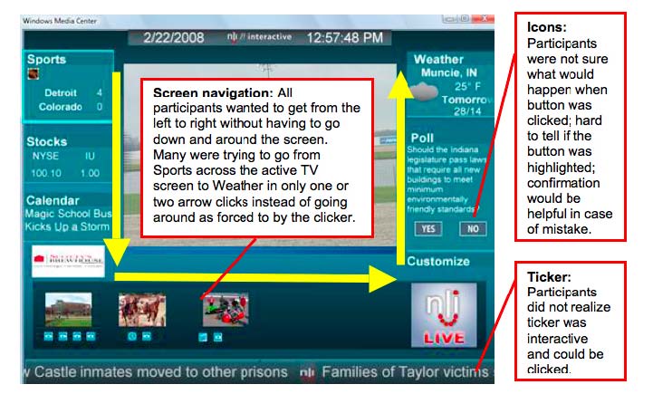
Figure 1 iTV On-Screen Icons, Ticker, and Navigational Pattern
A number of key concerns arose from the “think aloud” protocol that was conducted. First, none of the subjects realized the news ticker was designed to be interactive. Thus, an entire array of content was overlooked in all 12 cases. Second, icons that represented interactive content with story packages were often considered confusing. In eight of 12 cases, users reported they either didn’t know what the icons meant or they were uncertain about what would happen if they were selected. Third, and perhaps most important, nine of twelve participants were often frustrated and confused by the navigational path they had to take to get from one feature to another. During the periods when they were asked to “think out loud” while they interacted with the interface.
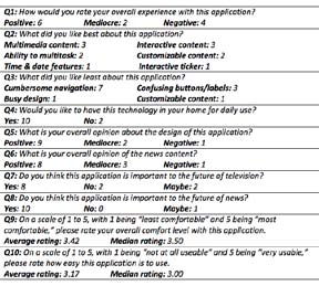
Table 1 iTV Usability Group One–Responses to Open-Ended Questions
The required compass navigation of the remote combined with three horizontal columns of content and five vertical rows meant users had to click down four times, over three times, and up twice to get from the Sports content in the upper left-hand corner of the screen to the interactive Weather feature in the upper right-hand corner of the screen. Figure 1 reflects this pattern. Designers and developers addressed all of these issues with design and/ or functional revisions prior to the next round of usability tests. It’s also important to note that in this session, the advertising icon was present, but not interactive. Thus, while most of the participants noticed it, the cursor jumped over it when they navigated through that section. In the following session, users were able to interact with ads, and responses to that feature were collected and are featured later in this paper.
In all sessions, users were also asked a set of specific questions related to the design, content, and functionality of the interface. Table 1 offers an overview of those responses and shows the trends that began to emerge in general feedback.
iTV Usability Group No. 2 (15 participants)
In the second set of usability sessions for the television application, users responded to a much different interface design than they did in the first sessions. After carefully considering feedback, designers and developers agreed that because so many participants complained buttons were confusing and navigation was frustrating, it was necessary to radically change the design of the interface. Thus, in some ways, it would be wrong to make a direct aesthetic comparison between what users saw in the first sessions and what they saw in the final sessions because it’s really an apples to oranges issue. It’s obvious that the visuals provided in Figures 2 and 3 represent a dramatic departure from what we started with.
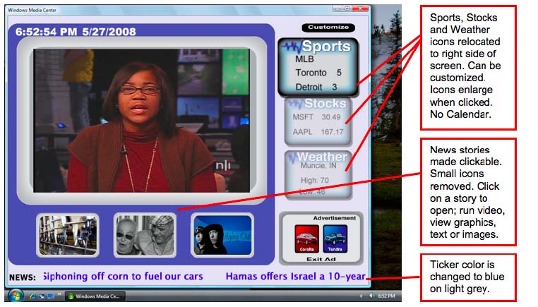
Figure 2 Redesigned iTV Interface
However, some key comparisons can, indeed, be made between how users are expected to navigate the two applications. In the new version, smaller icons with main stories were removed to make more room for the main icons, making them easier to “read.” Now, when the user selected a main story, the main icon moved to the left and the other two disappeared, making room for larger sub-icons with accompanying captions explaining that they were linked to additional interactive content related to that story. Also, the main video viewer was moved to the upper-left hand side of the screen, and the customizable sports, stocks, and weather sections, along with interactive ad links were moved to the right. Now, a user had a clearer path from one portion of the interface to another. The ticker at the bottom of the screen was also
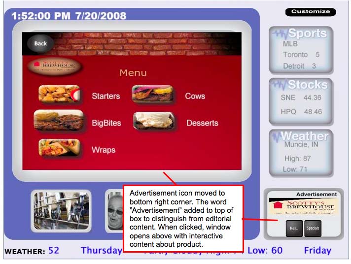
Figure 3 Interactive Advertising Features in Redesigned Interface
visually enhanced by changing the color of the type to blue on a light grey background from grey on a dark green background. Finally, by moving the advertising icon to the bottom right corner of the screen, it became more prominent and more distinguishable from editorial content. In this new version, ad content was also interactive (it was not in the first version), and Figure 3 illustrates one set of interactive features in an advertisement, through which users could view menus and weekly specials for a popular local restaurant. All of the users in this session expressed that they intuitively knew the ad content would be interactive, and they were split 50/50 on whether they actually wanted to interact with it. Some comments indicated interest in interaction with ad content. Yet, others expressed a common disdain for the presence of ads. One person noted that he wished he had the option of “getting rid of them from the screen if he wanted to,” and others said they didn’t care for any kind of TV ads.
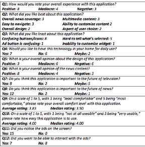
Table 2 iTV Usability Group Two–Responses to Open-Ended Questions
The response to navigational patterns was much more positive in this session than previous. Five of 15 users commented that the remote was easy to use and that the layout lent itself to an intuitive understanding of how to navigate through content. However, the overall reaction to the design of this version was mixed, at best. Five of 15 participants expressed that they found the design to be “okay,” “not too bad,” or “mediocre.” And four of 15 participants were very critical of design, noting that they were “not satisfied at all” with the look of the interface and that it was “not really all that modern-looking.” Likewise, users still had trouble figuring out what the story icons meant, in some cases causing them to be relatively uninterested in the actual content. Finally, even with dramatic changes to the look and function of the interactive ticker, all 15 participants completely missed the fact that it was interactive. Yet, when the proctor pointed out to them that they could do as such, all 15 said this was an interesting feature and more than half said they liked this feature.
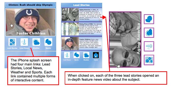
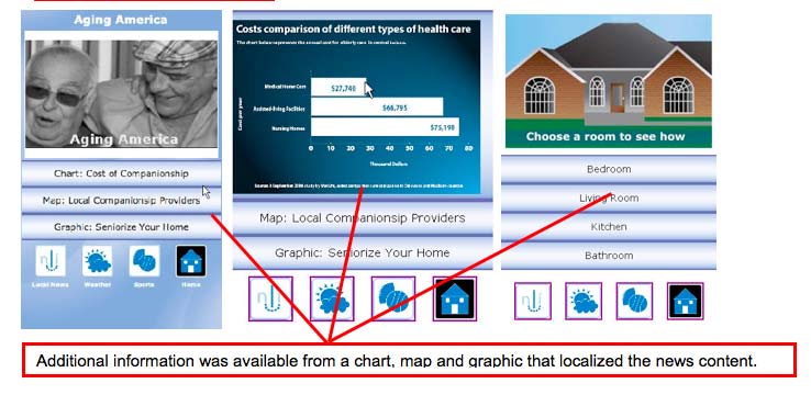
Figure 4 iPhone Design & Navigational Patterns
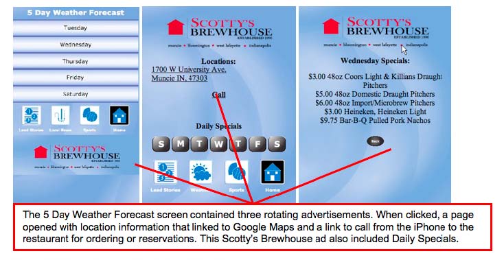
Figure 5 iPhone Interactive Advertising Feature
iPhone Usability Group No. 1 (11 participants)
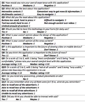
Table 3 iPhone Usability Group One–Responses to Open-Ended Questions
As noted by Table 3, the overall response to the iPhone application was very positive. Participants generally found the device and this news application very easy to use; they noted the design to be clean and attractive; and they said the news content was engaging and this overall concept important to the future of news. Figure 4 illustrates the overall design and content patterns, and Figure 5 illustrates advertising features. More than half suggested either that the buttons were too small in places and the overall navigation a bit cumbersome. So, in the second round, designers gave a bit more depth to buttons and reorganized content in small ways. However, overall the design and presentation didn’t change significantly in subsequent rounds.
iPhone Usability Group No. 2 (12 participants)
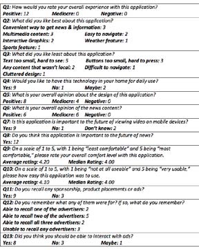
Table 4 iPhone Usability Group Two–Responses to Open-Ended Questions
Most participants expressed that they enjoyed the iPhone news and advertising experience, that the interface was easy to use and that the design was strong. Fewer participants–only three of 12–expressed that buttons were too small or hard to press. Likewise, the overall reaction to content was also favorable as all 12 participants expressed that they had a positive experience with the application. However, size in general was still a concern for most users. One participant said there was “too much on each screen. It’s cluttered, and the text and buttons have to be too small because of it.” Others noted the “text is too hard to see” and “the small screen with so much content sort of strains my eyes as I try to focus on things.” Yet, even those who became frustrated with size generally expressed that they found the interface to be useful, engaging, and an important advancement in news presentation.
What We Learned
The research team was pleased by the results of the initial usability tests. Although the sample sizes of participants aren’t representative of any larger community, the numbers are adequate for usability studies that attempt to draw out major trends in user behaviors, attitudes, and general opinions about an interface. Most usability experts maintain that with five users, you can begin to find about 85 percent of the problems that will trip up 1/3 or more of your users. And real trends in usability can begin to emerge in samples of 10. (11) Thus, we believe we uncovered a number of specific points related to these specific interfaces that are significant and that could be applicable to our and other’s future endeavors in related research and development. Following is a breakdown of these points by interface.
Interactive Television
Users were generally intrigued by the concept of interactive news and advertising with customizable content. And based on the fact that 17 of 27 expressed they would like to have this technology in their homes for daily use, 16 thought this type of application is important to the future of television, and 22 reported they thought this type of application is important to the future of news, it’s safe to say that this type of application may be of value to a larger audience. Likewise, in spite of navigational concerns in the first session and design flaws in the second, about half of the users reported having a positive experience, with only seven reporting a negative experience. It’s also worth noting that although the redesigned version included a much clearer navigational path for users, designers were still able to include all of the original multimedia content by creating layers for stories that started with a single icon that when selected revealed a branch of additional content available to users. Although they may have failed with the new aesthetic, there was a clear improvement in users’ ability to move through the interface with little hesitation or confusion. This may suggest that when a compass (left-right, up-down) navigational system is present, as is the case when a television remote is the tool for navigation, a design should be either heavy on left-right paths or heavy on up-down paths, but not heavy on both. The first interface navigated in a U-pattern, leaving a user with significant up-down, left-right action. However, the second interface, made use of an L-shaped pattern, eliminating a whole level of up-down navigation and favoring a left-right clicking pattern.
The use of icon buttons as both a tool of content (in that they attempted to illustrate what a story was about) as well as a tool of navigation (in that they were clickable, revealing additional story layers) was problematic in both versions of our interactive television interface. It’s often difficult, and in some cases impossible, to translate an entire story’s meaning in a single visual. And, explaining the icons with type is equally problematic because that method takes up a great deal of space and requires that a user read type on a television screen. They’re willing to do the latter in small doses. But it’s not a preferred method of TV viewing. Given that 11 of 27 participants noted that the confusing buttons were their least favorite part of the interface and 20 of 27 mentioned their dissatisfaction with the buttons at some point during their protocols, finding an appropriate method for this concept should be a goal in future iterations of our project.
Given the fact that all 27 participants had to be told that the ticker was interactive, a “how to use this interface” tutorial stored somewhere in the application might be a valuable addition to any such program. It’s interesting, though, that once they were told about ticker interactivity, most were more than a little intrigued by the idea. This may suggest that since scrolling tickers are generally elements that simply move across the screen and can easily be ignored, most users have no intuitive reason to believe they can interact with one. But, it may also suggest that the idea of being able to expand ticker content from single sentence fragments to extended stories if a user is interested in learning more about a particular item could be extremely attractive.
Finally, advertisements were used in the interactive television programming in two ways: as short promotional videos inserted at the beginning of feature news segments, and as stand-alone ads on the bottom of the screen that, when clicked, provided information about local products and services. The key to effective use of interactive advertising requires that the ads be integrated into on-screen news and information content. Interactive TV advertising requires the use of a pull-marketing strategy versus a push strategy used with traditional advertising.
iPhone
The iPhone news and advertising interface was overwhelmingly successful with our users. Twenty of 23 users reported a positive experience, with interactive and multimedia content (12) and convenience (6) topping the list of features users liked best. Likewise, 17 reported that they would like to have this type of application available to them for daily use, 17 said they thought this application would be important to the future of viewing video on mobile devices, and all 23 affirmed that this type of application is important to the future of news. In this regard, news organizations– print and broadcast alike–should take notice of the mobile device’s potential for shaping how audiences consume news and information in the years to come. Add to this that 20 users noticed ad content, all but four could remember the names of advertisers they encountered, and 15 felt they should be able to interact with ads, and you may have an equation for a successful news and advertising model, an obviously attractive for news outlets who have struggled in recent years to figure out a viable model for making money on the Web.
Footnotes:
- PQ Media. “Alternative Media Spending Growth Accelerates in 2007, Hastening Transition from Traditional to Alternative Advertising & Marketing Strategies.” http://www.pqmedia. com/about-press-20080326-amf2008.html (accessed October 5, 2008).
- Reuters. Study Highlights Importance of Extending Traditional News Brands Online. http://www.reuters.com/article/ pressRelease/idUS216962+13-Mar-2008+PRN20080313 (accessed October 16, 2008).
- David Cutts, “Bargain Interactivity.” Prism Business Media’s Broadcast Engineering. http://broadcastengineering.com/iptv/ broadcasting_bargain_interactivity/ (accessed April 10 2008).
- Thomas J. Colin, “Television’s Future.” CQ Researcher 17 (2007): 145-168.
- David Temin, “Siegel+Gale Brands Future of Interactive Television.” Reuters. http://www.siegelgale.com/dialogue/wpcontent/ uploads/2008/01/tru2way.pdf (accessed January 24, 2008).
- Marten Burger, “Key Issues Surrounding Interactive Computer Game Interface Design.” Metro 108 (1996): 37-40.
- Jan Schaffer, “Interactive Journalism: Clicking on the Future.” APME News, PEW Center for Civic Journalism. http://www. pewcenter.org (accessed August 1, 2008).
- Borko Furht and others, “Design Issues for Interactive Television Systems.” IEEE Computer, Vol. 28, No. 5, May 1995, pp. 25-39. LexisNexis Academic database (accessed September 2, 2008).
- CNET Network, “Intel and Yahoo! to Bring the Internet to Television.” Business Wire. LexisNexis Academic Database (accessed September 2, 2008).
- Ken Kerschbaumer, “Vivid Sky iPhone App Delivers for Sports Fans.” Sports Video Group. http://www.sportsvideo.org/portal/ artman/publish/article_12874.shtml (accessed September 14, 2008).
- Jakob Nielsen and Thomas K. Landauer, “A mathematical model of the finding of usability problems.” Proceedings of INTERCHI 1993. New York: Association for Computing Machinery, 1996: 206-213.
Bibliography:
Burger, Marten. “Key Issues Surrounding Interactive Computer Game Interface Design.” Metro 108 (1996): 37-40.
CNET Network. (2008). “Intel and Yahoo! to Bring the Internet to Television.” Business Wire. http://www. cnn.com/2008/TECH/12/31/yahoo.intel.tv/index.html (accessed September 2, 2008).
Colin, Thomas J. “Television’s Future.” CQ Researcher 17 (2007): 145-168.
Cutts, David. “Bargain Interactivity.” Prism Business Media’s Broadcast Engineering. http:// broadcastengineering.com/ iptv/broadcasting_bargain_interactivity/ (accessed August 1, 2008).
Furht, Borko et al., “Design Issues for Interactive Television Systems.” IEEE Computer, Vol. 28, No. 5, May 1995, pp. 25-39. LexisNexis Academic database (accessed September 2, 2008).
Kerschbaumer, Ken. “Vivid Sky iPhone App Delivers for Sports Fans.” Sports Video Group. http://www.sportsvideo. org/portal/artman/publish/article_12874.shtml (accessed August 1, 2008).
Nielsen, J. and T. K. Landauer. “A mathematical model of the finding of usability problems.” Proceedings of INTERCHI 1993. New York: Association for Computing Machinery, 1996: 206-213.
PQ Media. “Alternative Media Spending Growth Accelerates in 2007, Hastening Transition from Traditional to Alternative Advertising & Marketing Strategies.” http:// www.pqmedia.com/about-press-20080326-amf2008.html (accessed August 1, 2008).
Reuters. Study Highlights Importance of Extending Traditional News Brands Online. http://www.reuters. com/article/pressRelease/idUS216962+13-Mar- 2008+PRN20080313 (accessed August 1, 2008).
Schaffer, Jan. “Interactive Journalism: Clicking on the Future.” APME News, PEW Center for Civic Journalism. http://www.pewcenter.org (accessed August 1, 2008).
Temin, David. “Siegel+Gale Brands Future of Interactive Television.” Reuters. http://www.siegelgale.com/dialogue/ wp-content/uploads/2008/01/tru2way.pdf (accessed